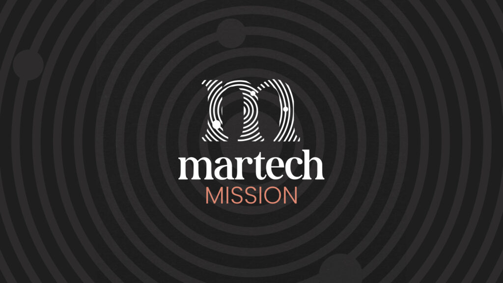
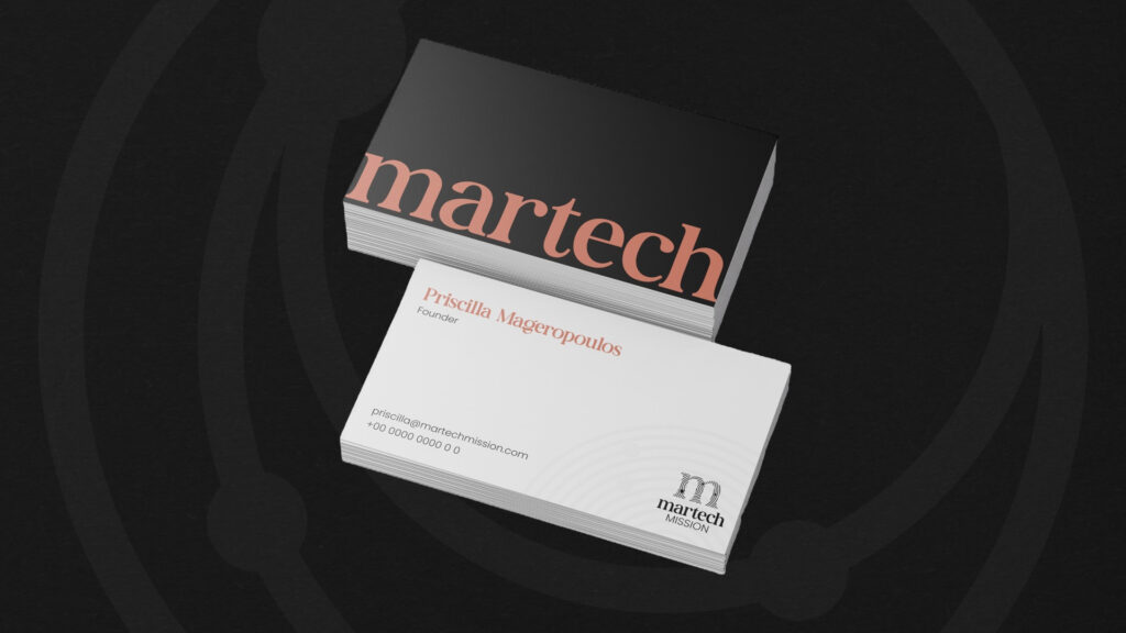
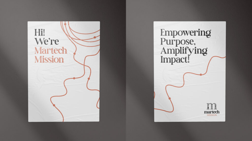
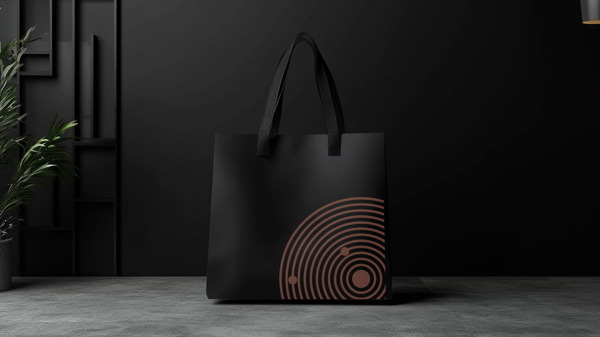
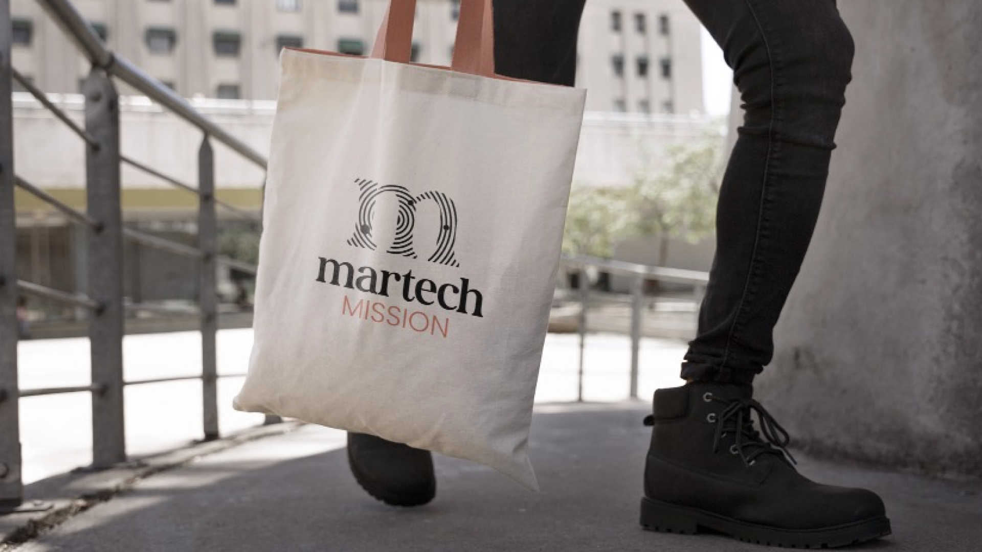
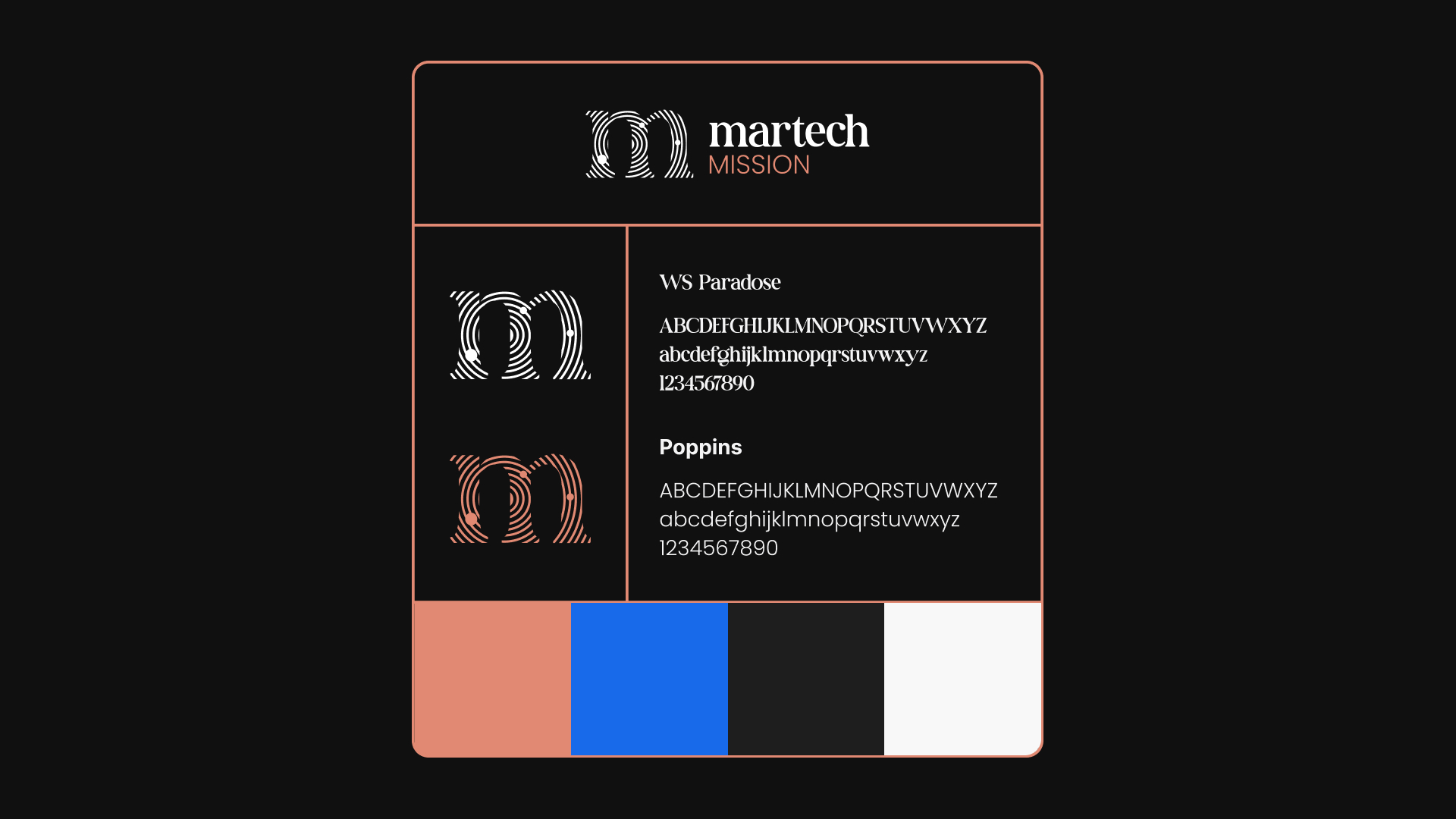
Branding Approach
● The logo symbol was carefully designed to represent the connection between different companies and organizations across the world.
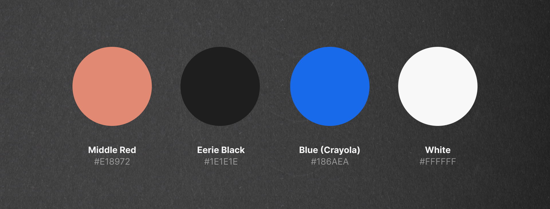
● We retained the client’s existing color palette while enriching it with additional complementary colors to enhance versatility and vibrancy.
●. The overall branding strikes a balance between corporate elegance and a more engaging, dynamic feel, avoiding an overly rigid or dull appearance.
